.png)
Introduction
problem
An agency that sells short-form video has a specific problem. Its own website has to show motion, or the pitch is not credible. But video is also the fastest way to make a site slow, and a slow site kills the paid traffic and search visibility they were also chasing.
On top of that, almost nothing on the page is static. New case studies land every month, the blog publishes regularly, the client logo wall keeps growing. A hardcoded site would have been out of date within weeks.
And the three services, social media, social ads, and influence, are sold to different buyers with different budgets. Stacking all three on the homepage would have meant none of them landed.
solution
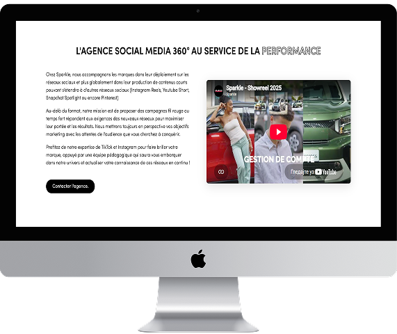
The homepage opens on full width video, with a separate transcoded file for mobile so phones never download the desktop cut. Posters load first, video loads after, and the rest of the page is built to be readable before a single frame arrives. That one decision is most of the performance story, and it is why a site this heavy still scores 91.
Case studies, blog posts, and testimonials all run on CMS collections. The team publishes a new client project from the editor and it appears on the homepage grid, on the case studies page, and on its own detail page. No developer, no deploy.
Each service got its own page instead of a homepage section. Social media, social ads, and influence now each have room to make their own argument, their own proof, and their own call to action, and each one can be pointed at from ads and search separately.
The two logo walls, more than thirty brands, run as CSS marquees rather than JavaScript sliders. They scroll continuously without adding a script to the critical path.
The FAQ at the bottom is structured, not decorative. It answers the questions people actually type into Google before hiring a TikTok agency, and it is marked up so search engines can read it as a set of questions and answers.

outcome
Your next website
starts with a call.