Introduction
problem
A group site has a harder job than a service site. It is not selling one thing to one buyer. It talks to freelancers, to brands, to partners, and to investors at the same time, and it has to make each of them feel like the page was written for them without splitting into five pages.
The second constraint was the deadline. Forty eight hours, fixed, no room to renegotiate. That rules out the usual approach of building loosely and tightening later. Everything had to be right the first time.
solution
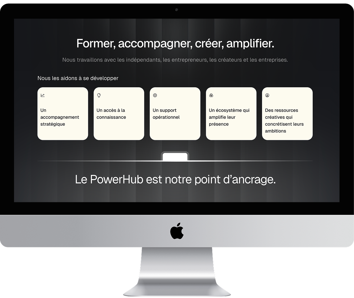
I built the page as a descent from abstract to concrete. The hero states what the group is in one line. The numbers come immediately after, because a claim like "PowerHub" means nothing until 2,000 talents and 100M generated are sitting under it. Only then does the page explain how the machine actually works.
The two divisions get equal weight in a paired section, each with its own logo, its own proof points, and its own exit link. That was the part worth protecting. Visitors who came for the Club should reach the Club in one click, and the parent site should not try to keep them.
Visually the page is dense. Layered background images, a full width image marquee, large display type, and a partner logo run. Density like that is usually where performance goes to die. I kept it at 98 by serving everything in modern formats, sizing images to the breakpoint that actually needs them, and keeping the animation work to the slider instead of scattering scroll effects across every section.
No CMS, on purpose. Nothing on the page updates weekly, and a static build meant the whole 48 hours went into craft instead of collection structures.
The page closes on a partnership CTA rather than a contact form. A group opening its next chapter is talking to a small number of serious people, and those people would rather email a name than fill out fields.
outcome
Your next website
starts with a call.