

Introduction
problem
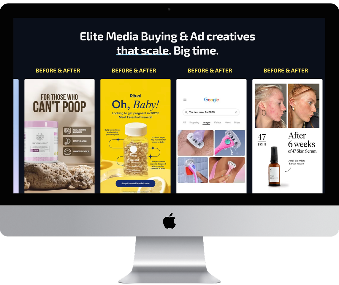
An agency that sells growth is judged on its own website before anyone reads a word of the pitch. Theirs needed to carry proof, positioning, founder credibility, and a free audit offer all at once, without turning into an endless scroll.
And it had to launch on a fixed date tied to their campaign, which meant there was no version of this where the build ran long.
solution
I mapped the page around one question a visitor asks in order. Are these people legitimate, do they understand my situation, what happens if I book a call. Proof sits high, above the fold, because an agency with 112 client brands should not make anyone scroll to find that out.
Positioning comes through a three way comparison built as a tabbed component (in house, agency stack, or Uncapped) so prospects place themselves without being told what to think. It is the most persuasive section on the page and it takes up less room than a single paragraph would.
Case studies and testimonials run in carousels to keep depth available without the page length that usually comes with it. The founder section carries the credibility that logos alone cannot. The audit offer and the booking flow live on dedicated pages so campaign traffic lands on something focused instead of a homepage.

outcome
Your next website
starts with a call.