

Introduction
problem
In this space, everyone says the same thing. Prospective clients arrive skeptical because they have usually been burned before by an agency that overpromised and disappeared.
That ruled out a standard services page. The site needed to name that skepticism directly and then dismantle it, section by section, without asking anyone to take a leap of faith.
solution
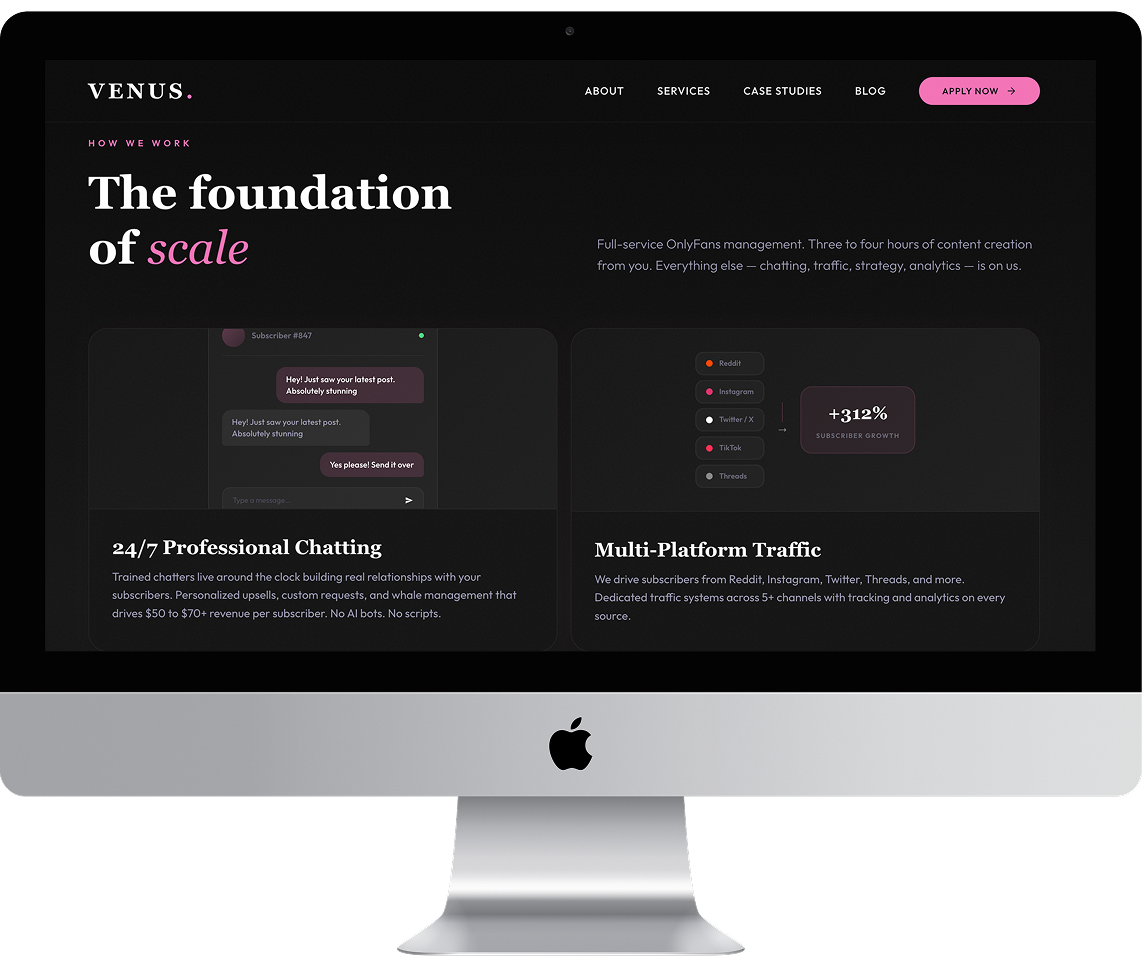
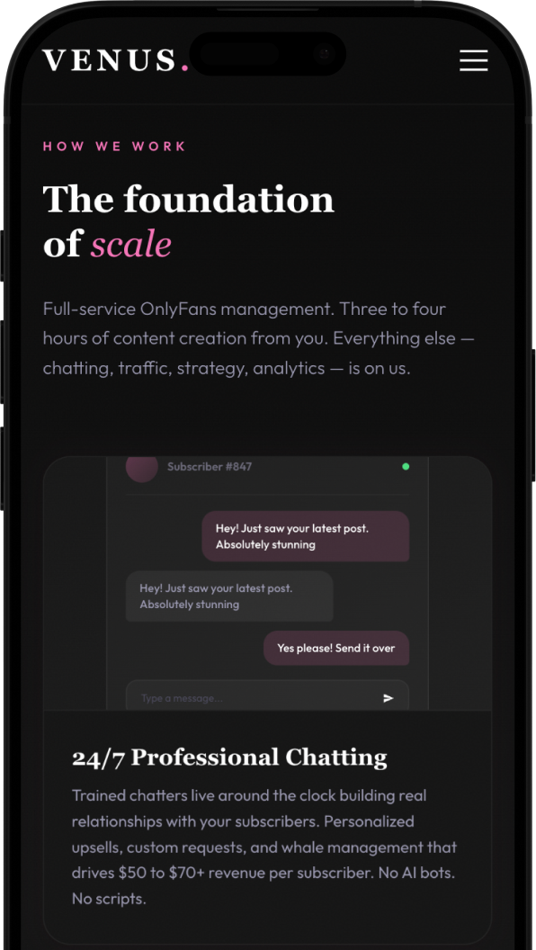
I structured the page as a sequence of objections and answers. It opens by naming the three reasons most creators stall, then immediately shows the operational detail behind each part of the service (chatting, traffic, content, reporting) using real interface mockups rather than icons, so the work looks like work.
Results are presented as anonymised profiles with before-and-after context. That was a deliberate constraint. Discretion matters more to this audience than name-dropping, and the CMS structure reflects that from the ground up.
The four-step process runs on a tabbed component so visitors control the pace instead of scrolling through a wall of text, and the FAQ sits in two columns to answer the remaining questions without pushing the call to action off the page. All of it in a dark, high-contrast theme that stays readable and loads at 99/100 on mobile.
outcome
Your next website
starts with a call.